Wall Crazy Help — Items
Contents
Introduction to Items
An
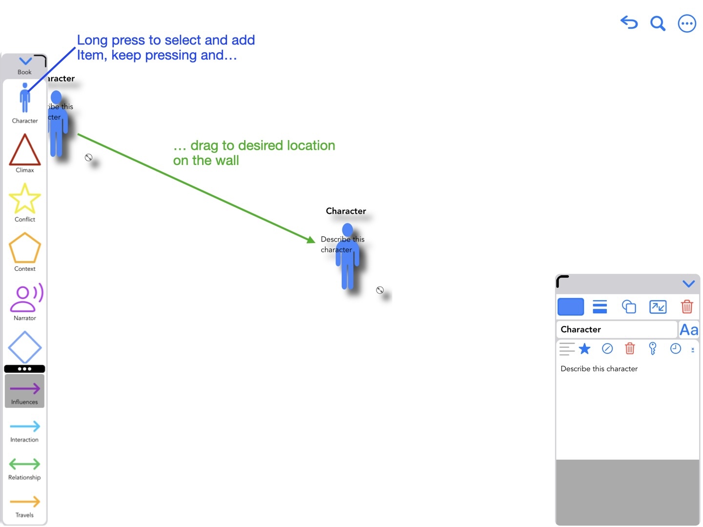
Placing an Item on a Wall
Tools for modifying Items
Once placed on the Wall, an
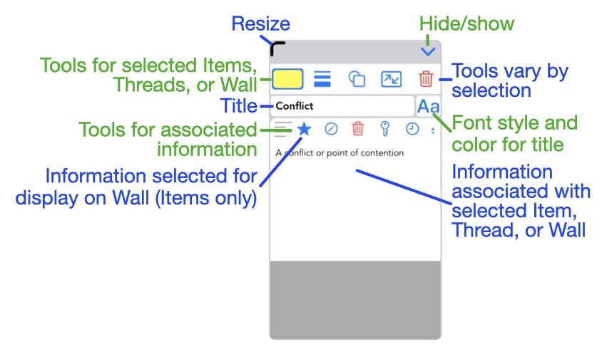
Information display
The following annotated images describe the tools available when one or more Items are selected.
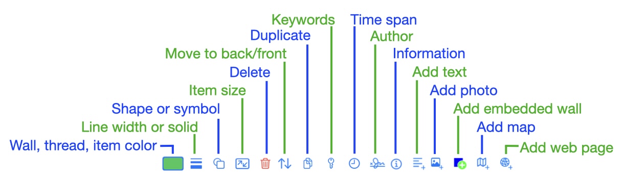
Tools when one Item is selected
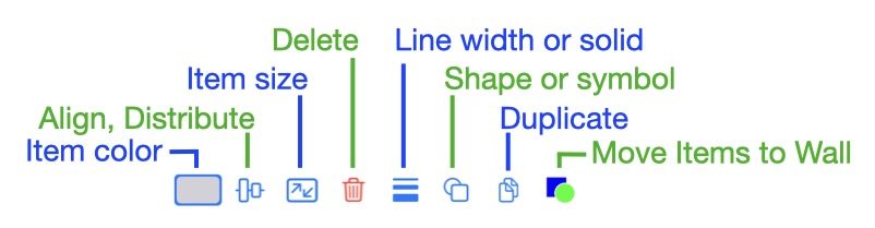
Tools when multiple Items are selected
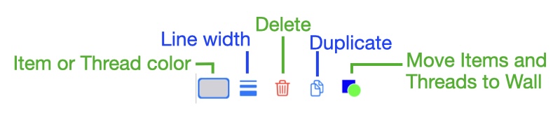
Tools when Items and Threads are selected
Adding information to an Item
Four kinds of data can be added to an Item: text  , photos
  , maps
  , and web pages
  . Walls can be embedded within Items by using the
  tool.
tool.
The following annotated screen captures describe the process of adding text to an Item.
Begin by selecting an Item and then scrolling the tools to find the add text ICON: . Tap the ICON to start adding text to the Item.
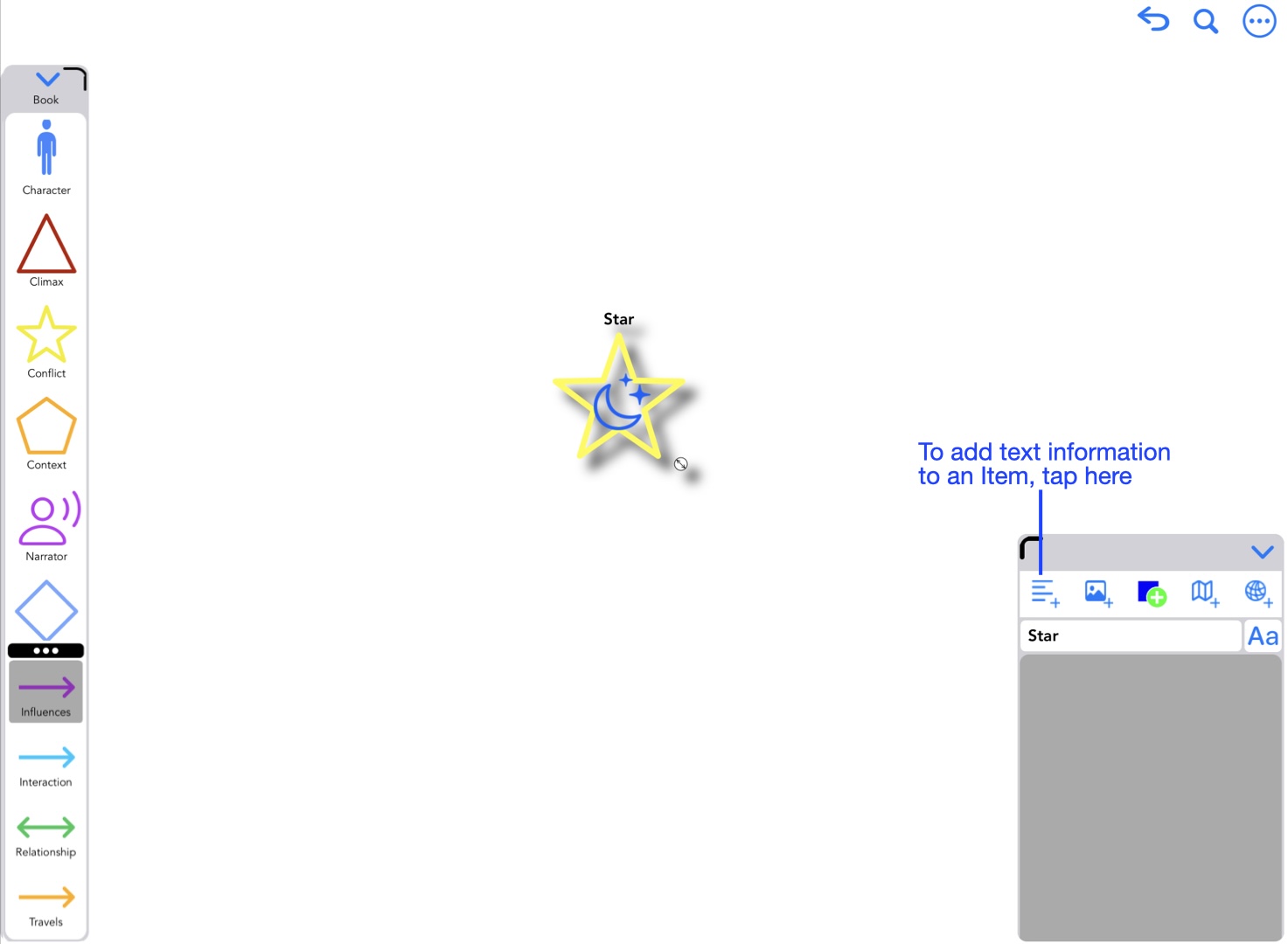
Begin by tapping the add text icon
Enter text in the view that appears. Text can be styled (font and color) and keywords can also be added.
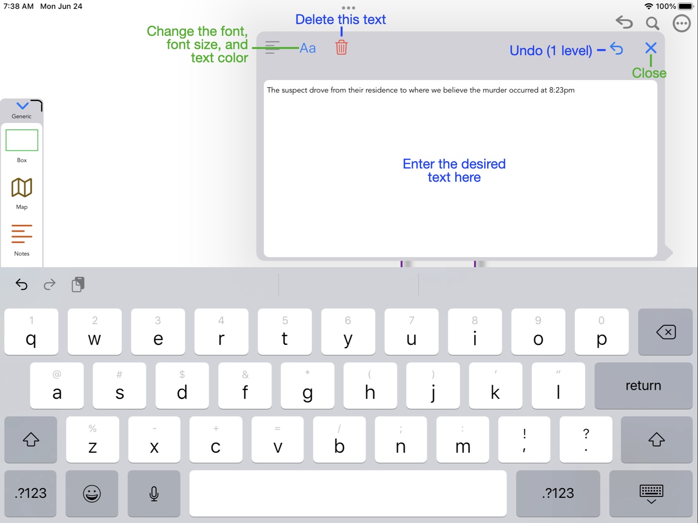
Add the desired text
Once the text is added, it will appear in the Information Display in the lower left. The text can be edited by either tapping the edit ICON  , or double tapping the text.
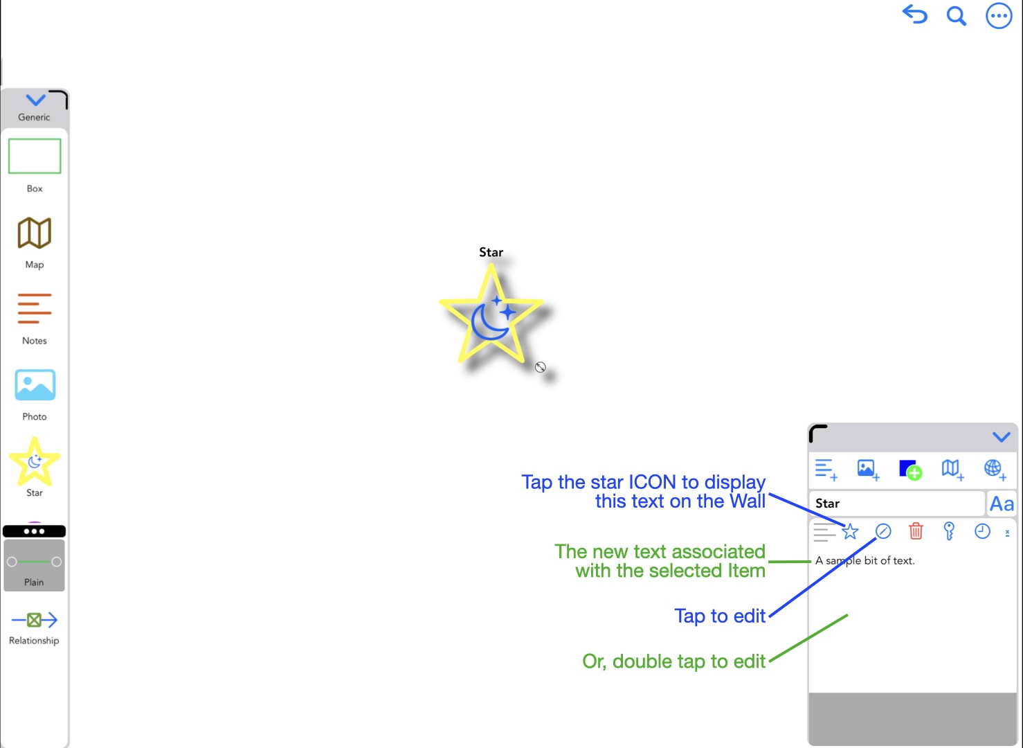
After text is added
By default, the added text is selected for display on the Wall with the Item. Tap the star ICON  to enable or disable display.
The same process can be used to add photos, maps, and webpages. The annotated screen captures below show the editors for each of these data types.
Photos can be added from your photo library, or by taking a photo with the device's camera. The photo can be cropped, and if the Item is not a symbol, the photo can be masked to the shape of the Item's geometrical shape.
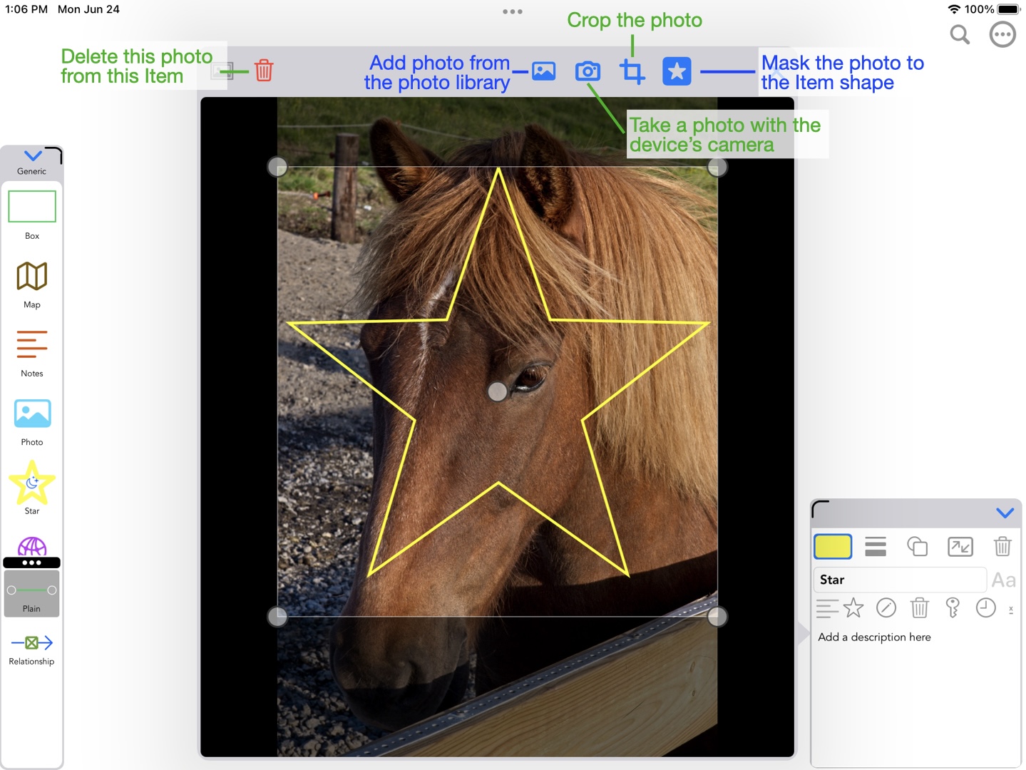
Adding a photo
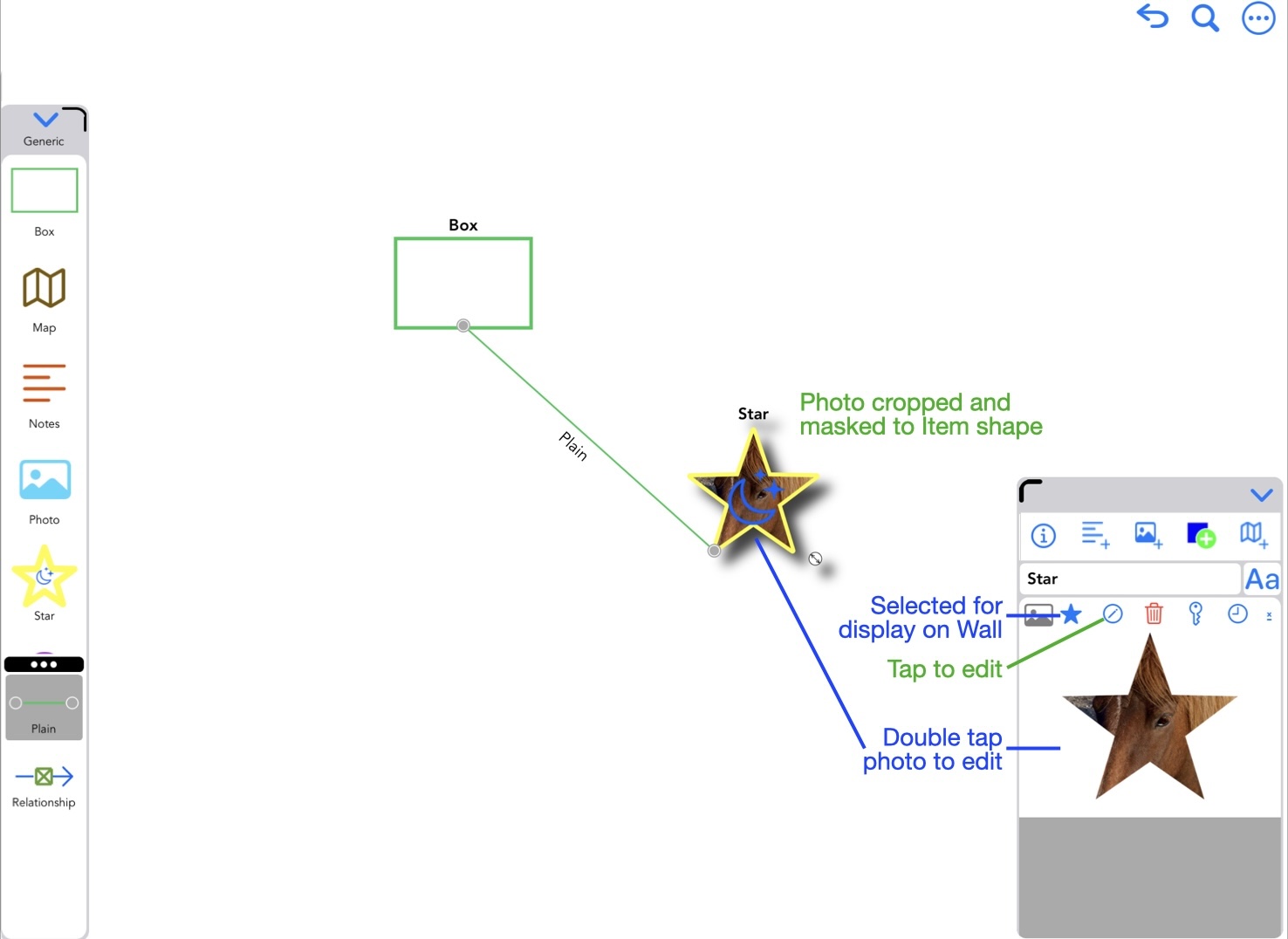
After adding cropped, masked photo
A map requires a location be supplied. A pin with a label can optionally be added.
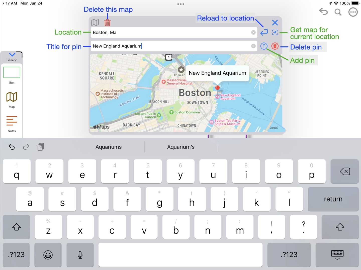
Adding a map
Many webpages are dynamic in nature. Some, like news web sites change minute by minute. You may want your webpage to be dynamic, that is, changes every time it is presented. Or, you may want a static view of the page.
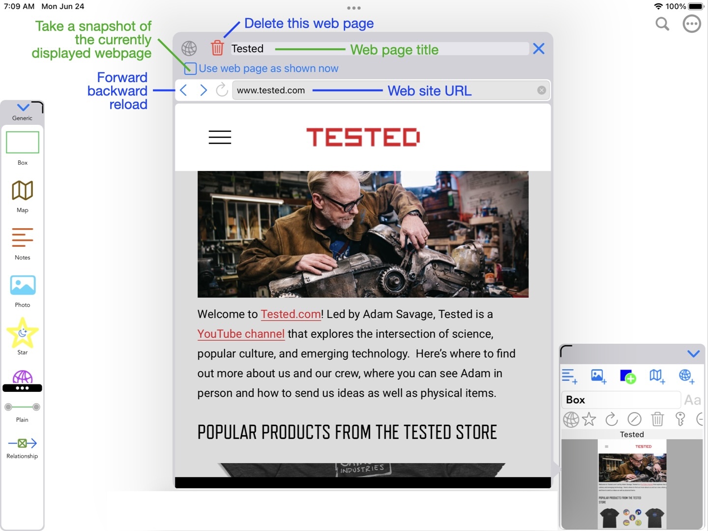
Adding a webpage
Item templates
As mentioned earlier, each
More help
For Support, contact us via Email
Send EMail to Swaystairs support